Ultimate Guide to EDM Banner Size: Optimize Your Visual Impact!
Hey wonderful parents out there! Are you ready to jazz up your emails with the perfect electronic direct mail (EDM) banner? Size matters, and we’re here to help you nail it down. Whether you’re announcing your little one’s birthday bash or organising a school fundraiser, the right banner size can make your email stand out. Let’s dive into the world of EDM banners and get your message across with a splash of style!
Why EDM Banner Size is Important
Before we get into the nitty-gritty of sizes and dimensions, let’s chat about why picking the right EDM banner size is super important. Just like Goldilocks found the porridge that was “just right,” your email banner size needs to be a perfect fit too. Too big, and it might not load properly on mobile devices (think of those little screens!). Too small, and your message might be missed. We want Goldilocks-level perfection for your EDM banner size!
Getting Started with the Perfect Size
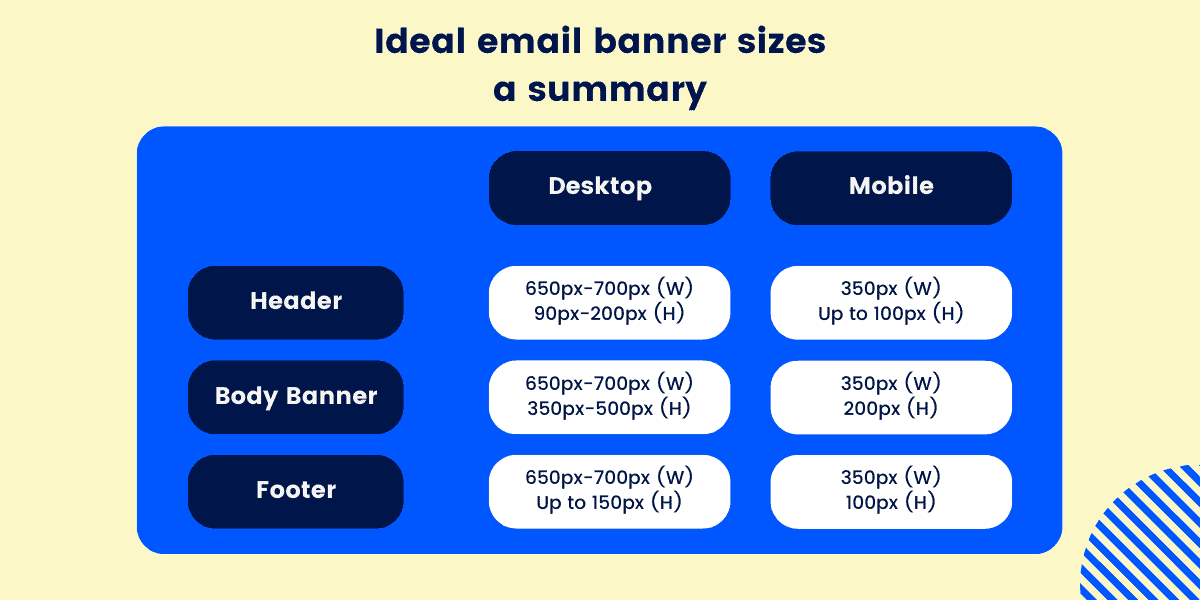
First off, most email banners perform best at a width of around 600-700 pixels. This width is ideal because it’s compatible with most email clients and devices. However, the height can vary depending on your design. A typical range for the height is 100-400 pixels, but it’s flexible according to your needs.
Mobile Optimization: A Must-Do!
Don’t forget, a big chunk of parents and folks are opening emails on their smartphones these days. So, ensuring your EDM banner looks fabulous on mobile is a must. Opt for a responsive design that adjusts the size automatically for different screens. Or, keep it simple with a design that is legible and scales down well on smaller screens.
Retina Display Consideration
Also, think about those sharp retina displays. For users viewing on devices with high-resolution screens, consider doubling the pixel density of your banner by creating it at twice the standard resolution. That means if you’re aiming for a 600px width, you’d actually create your banner at 1200px wide to ensure it looks crisp and clear.
Standard EDM Banner Size Tips
While the flexibility is there, here are some standard tips to guide you in creating a banner that’s sure to make an impact:
- Keep it consistent: Stick to standard sizes if you’re running a series of emails. It keeps the look cohesive and professional.
- Balance your content: If your banner is text-heavy, go for a taller banner to ensure it’s readable. If it’s image-focused, a shorter height will do.
- Test, test, test: Always send test emails to different devices to see how your banner holds up. The last thing we want is a beautiful banner that only looks good on your desktop!
Now that we’ve covered the basics of EDM banner size, let’s get your creative juices flowing! The magical combination of size, design, and message will elevate your emails from mere communication to a delightful visual treat. In the next segment, we’ll explore how to design a banner that harmonizes with your content, adheres to best practices, and ultimately wows your recipients.
In our comprehensive exploration, stay tuned for detailed insights on design aspects, tools you can use to create stunning EDM banners, and the best practices to follow for maximum engagement. Don’t worry, we’re here every step of the way to make sure your banners shine as brightly as your events!
So, brace yourselves for the next part of this guide, where we will dive into the creative process, ensuring that every email you send out not only reaches the inbox but captures hearts too. Let’s embark on this journey together and make every pixel count!

Five Essential Tips for Parents Preparing for EDM Banner Size
As you embark on the adventure of creating the perfect EDM banner, there are a few key points every parent should keep in mind:
- Know Your Audience: Understanding the devices and email habits of your audience can greatly influence your banner design. If most of your parent group reads emails on the go, ensure your design is mobile-friendly.
- Clarity is Key: Your message should be clearly communicated. With limited space, every pixel counts. Use large, legible fonts and concise messaging to ensure your banner is easily understood at a glance.
- High-Quality Images: Use high-resolution images for your banners to avoid any blurriness or pixelation, especially on retina displays. Remember, an image is worth a thousand words, and crisp visuals can leave a lasting impression.
- Brand Alignment: If the EDM is for a school event or a community activity, use colors and logos consistent with the branding. This consistency helps to build recognition and trust among the recipients.
- Call to Action (CTA): Place a clear call to action within your banner. Whether it’s “RSVP Now” or “Join Us,” make sure it’s visible and compelling for recipients to take the next step.
Tailoring Your Design
When tailoring your design, remember the context in which it will be viewed. A school newsletter banner might be more informative and text-focused, while a birthday party invitation can be more playful and colorful. Consider the emotional response you wish to evoke and design your banner to reflect that. And don’t shy away from templates or design tools; they can be a huge help, especially when you’re juggling between parent and party-planner roles!
The Power of Testimonials
Let the experiences of other parents guide you. Check out forums or groups where parents share their success stories with email marketing for events and activities. You can learn from their trials and triumphs, adapting their best practices for your own designs.
Conclusion: A Journey in Design
Designing an EDM banner as a parent doesn’t have to be a daunting task. Think of it as an extension of the creativity you use in everyday parenting. Just as you adapt stories to captivate your child’s imagination, you can craft banners that capture your audience’s attention and communicate your message with heart.
Occasionally, you might feel like you’re in a fairytale, dealing with the Big Bad Wolf of technical issues or the Witch of Deadline Woes. Nevertheless, with the right tools, insights, and a sprinkle of creativity, you’re well on your way to conquering the forest of digital design and delivering a banner that happily ever after tells your tale.
So, equip yourself with these insightful tips, and begin the enchanting journey of creating an email banner that will render your audience utterly spellbound. Ready to start your creative adventure? Let’s make those emails as memorable as the events they announce!
See more great Things to Do with Kids in New Zealand here. For more information see here
Disclaimer
The articles available via our website provide general information only and we strongly urge readers to exercise caution and conduct their own thorough research and fact-checking. The information presented should not be taken as absolute truth, and, to the maximum extent permitted by law, we will not be held liable for any inaccuracies or errors in the content. It is essential for individuals to independently verify and validate the information before making any decisions or taking any actions based on the articles.


